Students have asked that I take some class sessions in the New Year to specifically focus on learning to paint from photos. We normally paint from life in class, of course, after last session (see Painting in the Abstract Universe) "normal" is relative.
For the most part tho', in class, we paint from life because I believe that offers the best learning experience, however, knowing how to work with photo reference effectively is essential for any painter.
Some simple guidelines -
1. First and most important - We are NOT copying a photo; it is only reference. Knowing this will change how you look at your photos, how you take them and how you use them.
Look for photos that have 'good bones'; forget subject matter and focus on strong shapes and value patterns. If you squint your eyes and look at your photo, see how details are lost as patterns of dark and light appear. It can be helpful to turn the photo upside down and crop it in order to better see the light and dark patterns. Which brings me to the next guideline...
2. Don't be distracted by subject matter. Subject matter may have turned you on to this particular photo but interesting and beautiful shapes make it work. Shapes do not have to be "something" to work in a composition or to communicate to the viewer. Unclear, non-representational and unexplainable shapes are more expressive and spontaneous, and always more interesting.
Think 'SHAPES', not 'THINGS'.
3. It's good to have a plan- (See past Class Notes: 'Composition' and 'The Big Idea'). Whether working from life or from a photo, the artist's job is to select and arrange major shapes, values and colors to lead the viewer's eye around the painting in a pleasing way; that's composition in a nutshell. Having a few simple compositional ideas in mind beforehand and you will be able to view what is presented and turn the elements into a painting that works. Sometimes this involves changing or moving things for the sake of a composition. Just because nature put it there doesn't mean you have to.
Is that mountain going the wrong direction or are there too many trees? - change them. Get rid of what isn't working; only use what does.
4. Save details for the center-of-attention; too much detail and the painting becomes boring. This would be the case for any type of painting but working with photos often is an invitation to noodle. Don't do it.
One good thing about using a photo-reference is that you can use it again and again, make many studies and take some risks; see below.
1.08.2009
Class Notes: Same photo, Different Paintings
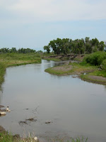
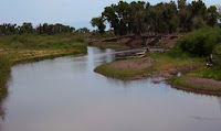
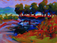

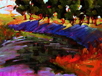 Here are 3 paintings, the smallest at the top is 6"x 8", the middle one is 6"x12" and the largest at the bottom is 12"x16". All were done from the same photo reference material shown; pretty dull. No awards here for the photography or brilliance of the day but the shapes involved kept me coming back to these photos again and again. The tree shapes play prominently in all the paintings as does the river shape that leads the eye in and around.
Click on the photos to see an enlarged view.
Happy New Year
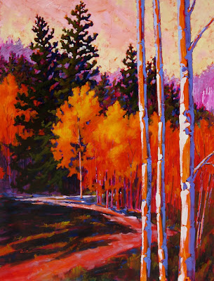
It has been awhile since I posted but the year started off with a flurry of snow, freezing weather, and lots to do. Fellow painter, Heidi Algrim and myself, braved the LaVeta Pass road last Sunday to take work to the (SPACe) Spanish Peaks Arts Council Gallery for the Members Show. We made it in good shape, I am happy to report. This will be a great little show with artists from throughout the region. More information is available on the website http://www.spanishpeaksarts.org/2009_shows_events/memb_show.htm . I hope to see you at the reception this Sunday, Jan. 11 between 4 and 6 pm. My painting "Conejos Walk", 48"x36", from last Spring, will be on display as well as 2 plein air pieces.
Click on the photo to see an enlarged view.
Subscribe to:
Comments (Atom)