Showing posts with label Notan sketch. Show all posts

7.13.2020

July Plein Air


Our evenings in Colorado have been warmer than usual but beautiful just the same. In the evening Plein Air Class I like to paint sunsets - but on this particular evening there were no clouds on the horizon so I turned to the south for a view across the road and that fire hydrant called my name.
In class situations,  I usually work small and this 6"x8" panel allows me to finish on site while giving students a clear example of my process.
Above is my finished piece, a snap of the view, and also my black and white (2 value) sketch. Because I am working small, the choice of subject is simple and I am most interested in getting a strong light and dark pattern.

4.22.2017

Class Notes: How to Use a Sketch

Something as important as a sketch can get over looked; - we sort of know it's a good thing - we aren't always sure why-
or worse, we don't know HOW to use it.
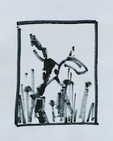
In class we have been painting animals using photo reference.
So- how does doing a simple sketch help with complex material?

Our purpose is not to make tight realistic drawings before we go to paint BUT to use the sketch to make the most important design decisions before going forward.
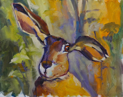
For the painting below, I had a photo of this crazy jackrabbit with lots of good detail.
It might be tempting to simply copy the photo reference as it is -  but the best way to use reference is to redesign the material to suit YOUR purpose - not the photographer's.
I will sidestep the discussion about photo copyrights - too involved - but suffice to say, it is always better to use photo material as "reference" not to COPY it.  Unless, of course, you took the photo yourself.
But when using ANY photo reference, design decisions must be made before touching the canvas with paint -
and this is where the disconnect happens.
While making these simple design decisions in your head seems like a good idea -  it's like pointing your car in the right direction just hoping you will arrive at your destination.
I never cease to be amazed at how willing beginners are - to strike out onto the great white canvas with out a map or a clue. Maybe doing a sketch seems too basic?
Hmmm . . . . The PAINTING is our destination.   And while I never have the whole piece figured out before hand -  I can go forward with greater confidence if I have made the basic design decisions in a sketch.
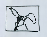
The simple sketches at the top show 2 ways my painting could have gone. One is vertical, of a rabbit in the landscape,
the other is horizontal and more portrait like - both from the same photo reference material.
The face of the rabbit attracted me to the photo in the first place, - so it made sense to design the painting with that in mind and not commit to a lot of extra background landscape, etc.


My sketches are about 3 inches wide, and easy to do;
size does not matter but the information does. I can visualize and arrange the information to see how it best works before committing any paint to canvas.
Once I have done a few sketches  it may become apparent that not every route is a good one, or I may end up choosing between 2 good ideas - No bad thing.  When I am satisfied with the arrangement of my shapes I will use the sketch as a road map and the basis for what  I want to do on the canvas.
Sometimes this takes only one sketch, sometimes 5.
Start with small, simple sketches and soon you will be adding more information to them and they will get better and will serve you better. You may even start to show them off as something you are proud of.

4.09.2017

Class Notes: More Confident Sketches

In class we have spent this session focused on SKETCHING and DRAWING - of course, as it relates to painting- but, these things go hand in glove and I do believe that better sketches make better paintings.
If better PAINTING is the goal, it's a NO brainer.
Taking the small amount of time to do a sketch before painting will contribute to a stronger and more well designed piece - and at the same time your range of sketching will improve with the practice.
This is a two-for that is SO worth the time spent.
With that in mind, I have encouraged the class to start doing their sketching with a Sharpie marker.
If the thought of using a black marker to sketch makes you gasp for air  -  consider this:
statistics have shown that people who use a marker - will develop drawing skills with greater confidence more quickly than those who are always erasing, shifting and correcting their marks.

The benefit is huge and the upshot is more confident mark making and more confident sketches. It's not for the faint of heart - or those committed to pencil sketching.
And YES, you will do more bad sketches
but ultimately, more GOOD sketches.
I have included here 3 of my Sharpie sketches in a progression from simple to more complex:
the first, at the top is from reference and is a simple line sketch showing placement.
The second sketch was done en plein air - it shows value and placement; also called a NOTAN sketch.
The third is what I might consider a finished drawing-
or how I like to draw portraits.
I use the Sharpie fine point for most of my sketching, and I buy them by the box.
But I also love the kids Crayola markers, in black.

9.27.2016

Power of the SMall

We have a saying around our house "he small". . . .
- or she, or it - and tho' we speak with a sympathetic note,
the phrase suggests both - condition and camouflaged strength.
Small painting, big impact.
I painted this piece in the last plein air evening class of the summer;  quick notes in late light,
of a large cottonwood.
The power of the NOTAN and the energy of rapid strokes belie the small size.
He small. . . . .
"Raking Light",  6"x 8" - SOLD in Manitou Springs

3.07.2014

Classes Notes: Painting Drapery


I confess, I have had a bias against "drapery" - probably from the tedious hours of drapery rendering that we did in college painting.  ZZZzzzzzzz.
And when there are so many other fun things to paint -  drapery, for its own sake seems SO prosaic.
But, when a student made the request - I figured it was time.  In my on-line research I found: "The secrets to painting drapery" (it is still a secret),  "How to make elegant drapery",  "Understanding Drapery", etc, etc.
This is all good stuff but I can't believe "drapery" is so much different than anything else 3 dimensional that we are trying to communicate on a 2 dimensional plane.
It has to be about shapes.
The top/red drape is my first demo and I started with a Sharpie sketch to organize the big shapes.
It was hard. It was fun.
After class I began to look at books for painted drapery - classical and otherwise and when I pulled out a book on Michelangelo's Sistine Chapel- a light went on. I am sure that sounds pretentious . . . what can I say.
But, his drapery is so bold, so simple, so understandable.
It makes sense, that a sculptor would paint drapery that was oh, so readable, and not tight or bogged down with minutiae.
This photo, from the book by Lucinda Hawkins Collinge & Annabel Ricketts, is what we studied in class.
I can't say we came up with any secrets to painting drapery but just looking at work from a master made a big difference. We all did stronger work in the second week.  It seemed to make real sense.
My second demo is the green one and even in its unfinished state it has more volume.
Thanks Michelangelo.

11.25.2013

Class Notes: SEEING Values and Creating the Notan


Good art/design is based on the interaction of light and dark; we call it Value. Seeing the Value pattern is key to strong work. That's why painters squint: at the still life, at the landscape - squinting helps to better see the Value pattern in the subject. Seeing the light and dark pattern and translating that to a 2 value notan sketch creates a Value foundation for the final work.
We have all seen work where the artist has no sense of a value pattern; it appears spiritless and blah.
In a great painting we may enjoy a stunning image or beautiful technique but you can be sure - behind every GREAT painting is a strong Value pattern, planned at the sketch/notan stage to create a well organized arrangement of light and dark.
Above is a simple class setup and the notan created for the painting. Can you see the notan in the photo of the pears?
French Impressionists used the notan idea as did the great illustrators of the 19th and 20th century- I am thinking of Howard Pyle and Norman Rockwell.
Call up some their work on the internet and take a look. Squint and see if you can see the notan - or the strong pattern of light and dark.

11.02.2013

Class Notes: Notan - as in "You have a nice NOTAN"

I have never heard the word thrown around so much as I did last week in Sedona. Someone actually came up to me while I was painting and said,
"I love your Notan";
Hmmmm. I'll take that as a compliment.
Notan refers to a type of sketch and comes from the combination of the 2 Japanese words for 'light' and 'dark'.
Artists use the term to refer to the interaction between the two - like a dance; and it's a cool word that addresses it.
Good design, consequently all good painting,  is based on the balance and play between light and dark, regardless of color.
As well, its importance strengthens the argument for creating a SKETCH before painting.
Shown here is the type of 2 value 'notan' that I create with a Sharpie pen for each painting; just black and white - no 3rd value gray.


Most artists use the more common, 3 value sketch (or 3 value notan) to lay out values and it is what I teach in class.  I have written several blog posts on creating a simple 3 value sketch, which is a good thing to know.
Having said that however,  in my own work outside of class, I do a 2 value 'notan', and started doing that early on when I realized how the power of a 2 value sketch could revolutionize my work; and it has done just that.
So, we will spend some time this class session exploring the dance of light and dark balance  - while working the 2 value notan in class.
Bring a small sketch pad and a Sharpie pen and don't forget the paints.
To read more about 'notan'- scroll down the labels on the right to see Class Notes on Sketching and Notan.

6.01.2012

Class Notes: Compositional Motifs

The dictionary defines  Motif (noun) as "a distinctive feature or dominant idea in an artistic or literary composition".


Most artists use them as something developed within the sphere of their own work. A motif can be idiomatic, coming about as an artist's work evolves and becomes more specific to the artist; an expression of their own creative "voice".
I started thinking about this while preparing for the Creede Quick Draw. Unlike most of the plein air quick draw events that I participate in which are about an hour and a half and require the artist to paint from the view, the Creede Quick Draw is only an hour but allows artists to paint from a sketch, or recreate something that they had painted previously.  It is a good opportunity to do a painting that is memorable and distinctly "me".
This got me looking for themes in my own work and compositional ideas that I have used over and over: aspens in the woods, cotton wood trees, deep forest scenes; these are compositional ideas, or motifs that I like and return to.
For our class sessions I came up with 4 compositional motifs taken from my sketches, and we used them as a starting place for small 6"x 6" paintings. The great thing about these is that once the shapes are established, all kinds of things can be changed to create distinctly different paintings: a high or low horizon, light direction and value variation, color or season change, the addition of other elements.


With the two bottom sketches I have shown paintings that were created from them. The Aspen and Pine piece is my 10"x 8" Quick Draw painting from Creede using the Aspen sketch.  The idea of a small stand of aspens together with pine trees is something I see all the time and creates a naturally strong value sketch. The other 2 paintings are based on the Cottonwood Grove motif. One painting is vertical, one horizontal and they use very different color and levels of stylization, but both reflect the same compositional motif. Cottonwood trees grow in groups like this all over the San Luis Valley and I use them as a theme in my work with a compositional motif that is very adaptable.  I look for these compositional motifs in the landscape. It is one way I have used composition and regional elements to develop a more distinctive painting voice.

1.28.2012

Class Notes: The Value of a 2-VALUE Sketch

My favorite type of sketch is the 2 value sketch, or 2 value notan; here at the top.
I use a bold sharpie-marker to lay in the dark values of the sketch and leave the white of the paper for everything else. I skipped the mid-tones, so for every shape I must decide to push it to black or the other direction, to white. The 2 value sketch may take some practice but the design potential is huge. Suddenly, you will begin to see patterns and shapes form that you may not have been able to see in a 3 or 4 value sketch.
Compare the top sketch to the more conventional 3 value sketch below it. Both explain the light and tell the story but present very different pictures.
SideBar: I use the 2 value sketch in my own work because of the graphic quality it brings to the paintings.
In both sketches, I am very conscious of connecting the darks so that the viewer's eye can move across the composition with out a break. The final result was this little painting I did as a class demo.


The practice of translating what you see into small value sketches will help develop your artist's eye for VALUE.
What ever kind of sketch you choose to do, it will set you up to know where you are headed in the painting;
You master the work instead of letting it master you.
And we all know what that feels like - when a scene has just kicked your butt. . .
Go back and attack it with a value sketch.

Next time: TIPS on creating better value sketches.

1.23.2009

Class Notes - The SKETCH


Do I hear a collective groan?
I always feel a little "parental" when talking about doing a sketch before the painting; like saying "Eat your vegetables; they're good for you" - maybe reason enough NOT to do it; oops, let's not go that way.
I painted in the landscape for years without doing preliminary sketches and arrogantly felt that I didn't need to. What would it serve?
Though, in my past life as a graphic designer, the sketch/layout was the way to communicate my thoughts for everything, from art directing an illustrator or photographer to communicating visual concepts to a client. The layout was the visual language we spoke - NOT doing a layout would have been like suddenly becoming mute - by my own hand; not even an option. But, what does that have to do with the painter?
At this point, my brain wants to go out into a zillion directions- let me just say - the most common thing I hear from student painters, and even the more advanced painter, in the landscape is: "I'm lost". Ever been lost in the landscape? Ever found yourself miles up a trail with no water bottle, no lunch, no end in sight and really big blisters? (Gee, it was so beautiful, I just had to JUMP in and GO). It's called being unprepared and it can ruin the day, the hike, the painting.
The sketch is that bit of preparation that can make or break the whole day. My plein air sketches are simple, small, but are the map that keeps me ON the trail to the finish. See the next POST: we left the site way before that painting was done, but - not without a sketch. That map helped bring it together in the studio. I rely on the sketch because in it, I have already organized the values, the shapes and my thoughts on the scene; the photo is only documentation of the day. The sketch is my mind on the subject.
Some small photos here are examples of the type of sketch I do -
2 value, simple, done with a fat Sharpie; cometimes called a NOTAN. I am not selling this type of sketch but the idea that any sketch - is a Good Thing -
and it IS good for you.